
Dow Theory Swing Trade Type EA Selene] Won a prize at the FXGT trading competition!


What are your basic thoughts on the Dow Theory Indicator and SMC, The first article and is explained in detail in the first article.
Please check out our previous article for more details! For more information, please check out our previous article.
Many traders draw parallels by thinking, "Will this area work as a resistance or support line?" Many traders draw a parallel line by thinking, "Will this price work as a resistance line or a support line?
But even if you know you should...
There are many problems associated with manual operations, such as In order to solve these problems, this version of the software has been upgraded to
A "Supply / Demand Zone" function has been added to automatically check and draw zones that are likely to function as resistance and support levels over a long period of time in the past.
The multi-timeframe function also supports the detection of resistance and support levels in upper legs, allowing users to understand important price zones in multiple timeframes on a single chart.
How to set up Setup :.
Changing the zoom level on the chart, we see a green/orange zone. Orange indicates the Supply zone and green indicates the Demand zone. Around these zones, you can see prices pushing back near the zones or breaking vigorously. I am sure everyone has experienced the mistake of entering a market thinking that the price might still rise after a strong rise, only to see the price reverse and fall to a loss. If you can see the important price range, you will be able to avoid losing trades more often, and you can expect to increase your win rate and improve your profitability.
Let's take a deeper look at the background behind the functioning of resistance and support levels, from the perspective of the balance between supply and demand.
The Supply zone indicates an area where strong selling pressure has occurred in the past near the relevant rate. This is the zone where market participants believe that they should sell near the relevant rate (i.e., the fair price is below this rate).
Since sell orders to lock in profits (sell orders to unwind long positions) and new sell orders by participants expecting a reversal and decline at the relevant price tend to enter near the zone, selling tends to prevail when the price approaches this zone, and the possibility of a price decline increases. On the other hand, if the price breaks out of this zone and continues to rise further, it is more likely to continue to rise vigorously. In addition to the fact that there are simply more buy orders than sell orders, participants who had placed new sell orders using this zone as the entry basis are likely to use the upper limit of the zone as a stop-loss line, so when the price exits the zone, buy orders due to stop-losses will also be involved and the price will likely rise vigorously. This would increase the likelihood of a vigorous move higher.
The Demand zone indicates an area where strong buying pressure has occurred in the past near the relevant rate. It can be said that market participants believe that they should buy near this rate (i.e., the fair price is above this rate). This zone is also where buy orders to take profits (buy orders to close out short positions) and new buy orders are likely to be placed by participants who expect the price to reverse and rise at the relevant price. On the other hand, if the price continues to fall further out of this zone, it is more likely to continue to decline vigorously. In addition to the fact that there are simply more sell orders than buy orders, participants who had placed new buy orders using this zone as the entry basis are likely to use the lower limit of the zone as a stop-loss line, so when the price exits the zone, sell orders due to stop-losses will also be involved and the price will likely fall vigorously. Therefore, the possibility of a vigorous decline is considered to be high.
In the SMC (Smart Money Concept), it seems that they are trying to analyze the balance of supply and demand (or their imbalance) from various factors, and there are explanations about Supply/Demand in various ideas. As far as I have studied, there are explanations about Supply/Demand in the following elements.
The area that includes the apex of the starting point of the FVG occurrence. The idea that institutional investors are starting to set up around the starting point of the bar that formed the FVG = important price area and is likely to function as a Supply/Demand zone.
The area containing the waves before forming the Order Block.
A phase in which prices remain within a certain range. It is sometimes described as Accumulation. It accumulates liquidity and is often the starting point for subsequent major price fluctuations.
CHOCH stands for "Change Of Character" and refers to the benchmark rate for market reversal.
This rate corresponds to Major CHODH.
From my cursory research, it appears that the above are used as resistance zones. I am sure these are not all of them as I have not studied them yet, but I think they are helpful in deciphering what price zones are demand and supply zones.
Based on its closeness to the Dow Theory, the Supply/Demand zone is detected using the apex of the Major CHOCH formation. Since this rate is the highest/lowest price before the market turnaround, it is easily understood as an important price zone, and since many market participants are aware of this rate, it is expected to function easily as an indicator in terms of mass psychology as well.
Even if some entry conditions are met, if the Supply/Demand zone is in front of the profit margin, there is an increased possibility that the market will reverse without reaching the profit margin even if entry is made.
When an entry signal occurs at a point where the zone is close by, refraining from entering immediately will make it easier to avoid a case where the market reverses immediately after entry and you end up with unrealized losses.
For example, consider the case shown in the figure below.
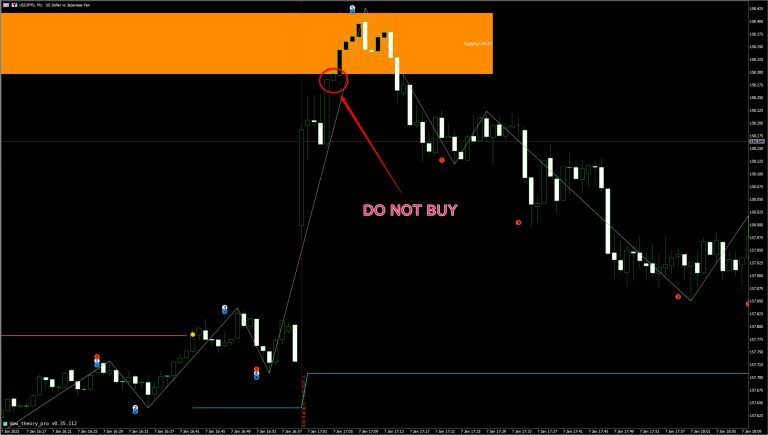
After the release of the indicator, the price rose through a large window and after forming a slight push, it again recorded a large positive line and made a new high. It is possible that the price will continue to rise, but we can see that there is a Supply zone in the upper leg of the price range slightly above. If there is no resistance line, we could enter the market as it is, but if we know that the price is likely to reverse and fall here, we should avoid entry. You may be able to confirm this by opening the upper leg chart or going back to the current leg chart to find the corresponding price zone and drawing a parallel line, but it is very time-consuming to repeat such a process each time. However, it would be very time-consuming to repeat this process every time. If the upper leg zone is displayed simply by starting the indicator, the possibility of missing the upper leg zone would be greatly reduced.
When the price reaches the Supply/Demand zone, the entry is made after checking for signs of a rebound. Even if the price reaches the zone, buying pressure may be so strong that the zone is breached immediately, Therefore, you can improve the accuracy of your trades by entering the market after confirming that the price has rebounded near the zone.
A simple method is to detect the tops (peaks and valleys) of the Dow Theory indicator. In the case of the figure, the 5-bar rule (can be changed with parameters) is used, so in a total of 11 bars, including 5 bars before and 5 bars after a certain bar, a peak is recorded when the high price of the middle bar (6th bar) is the highest, and a trough when it is the lowest. As with the zigzag judgment method, once a peak is recorded, if a peak is recorded at a higher price, the peak is redrawn (=repainted), but this can be used as a judgment method if the objective is to detect a reversal signal at an early stage. Although this is not a strong evidence by itself, its reliability increases when combined with a reversal fall after the Supply zone is reached and a reversal rise after the Demand zone is reached. Although there are many false signals due to the objective of early detection, the ability to reduce the stop-loss range leads to trading with a small loss and a large profit.
There are many market participants who believe that an RSI above 70 is overbought (= possibility of reversal and decline) and below 30 is oversold (= possibility of reversal and rise). Since indicators that are seen by many users tend to work well (i.e., mass psychology), it is also effective to use this as a basis for one of the indicators.
A Dow trend reversal is the following condition
However, in the case of a sharp rise as shown in this chart, the rate of the trough that is the starting point of the corresponding wave is quite low even if the low is raised, so waiting for a Dow turnaround will result in missed trade opportunities, and in many cases the turning point will be recorded at a large return from the stop-loss line, which is In many cases, the turning point will be recorded at a large return from the stop-loss line, so it is not suitable for loss-making trades.
Let us now look at the same figure as in the previous case.
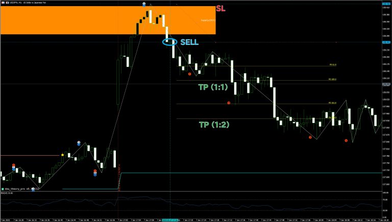
The rate has stopped rising after reaching the Supply zone, but we will use some rule to determine that it has reversed.
Inversion Determination Method 1: Vertex Detection
The number of bars for apex detection is set to 5 (can be changed by parameters), so the apex (mountain) after reaching the Supply zone was detected at 17:16. This is a good entry signal to go short early.
Reversal Confirmation Method 2: Reversal from RSI Threshold Reach
The RSI at 17:16 shows a drop from above 70 to below 70. This, together with the fact that the price has stopped rising in the Supply zone, the detection of the apex (mountain), and the RSI reversal, confirms the three reasons for the price reversal. By setting the stop-loss near the upper edge of the Supply zone (or the apex (mountain) in this case), the stop-loss range can be set narrower. Even with a risk reward ratio of 1:2, this case could be profitable.
Reversal Confirmation Method 3: Dow trend reversal
In the case of this chart, the push low (light blue line) did not rise significantly because of the sharp rise after the indicator was released. Since the Dow trend reversal did not occur, this is not a consideration.
A clear break of the upper edge of the Supply zone or the lower edge of the Demand zone will increase the likelihood of rate extension in the direction of the break.
However, as in the case of stop hunting, there may be a reversal after a slight break, so the criteria for a break to avoid damashi should also be considered.
etc., once confirming the direction at the time of break, or confirming that the break is made with sufficient trading volume, will lead to improved reliability.

In the case of the above chart, the price did not stay near the Supply zone for a long period of time and did not reverse and fall, but rather made a push once and continued to rise. If long entry is made at the timing of a large positive line after a trough is recorded, and the stop loss is set near the lower edge of the Supply zone, there is a high possibility of gains even if a slightly larger profit margin is set, such as a risk reward ratio of 1:2.
The zone can be considered as a resistance level until it is broken.
There is no indicator or trading rule that works 100% of the time. To improve the accuracy of your decisions, it is important to use multi-timeframe analysis and other indicators to confirm multiple rationales.
Also, when actually trading, consider the number of lots and stop-loss range appropriate for the amount of funds, and try to trade reasonably so that you do not lose most of your funds in a single trade.
This can be changed by setting the number of bars used for apex detection (N-bar rule). The latter will capture longer waves, resulting in a different timing of Dow turnaround and a lower detection frequency of the highest and lowest prices in each trend section. By increasing the value of the N-prong rule, only the more important price range can be drawn. In addition to the N-rule, by using the multi-time frame, you can also capture important price zones based on large waves in the upper leg.
In this issue, we explained the new Supply / Demand function of the Dow Theory Indicator.
We hope that by identifying the points where the balance of supply and demand tends to be imbalanced, we can help you improve your trading win rate.
You can try the indicator for two weeks free of charge. We encourage you to take advantage of the free trial so that you can evaluate whether there is anything you can apply to your own trading by actually running the indicator.
If you have traded more than a certain amount in your real account opened via this blog, you can continue to use the indicator for free after the trial ends.
We hope you will take advantage of the Dow Theory Indicator and its new features to trade smarter!

